When the Picture Is the Data
The lasso is the query. The shape you draw is the answer.
I like things that go fast. And I like reading academic papers. This week, those two interests collided when the little agentic pipeline I built for surfacing interesting papers bubbled up a study posing a question I had never asked myself: what is the fastest way a human can interact with data?
Why Pictures, Why Fast
In his TED Talk “The beauty of data visualization,” David McCandless says “by visualizing information, we turn it into a landscape that you can explore with your eyes, a sort of information map. And when you’re lost in information, an information map is kind of useful.”
You can read a spreadsheet that’s a few thousand rows. But when you’re facing a spreadsheet with a billion rows, “lost” is a really good description. You can’t read it all, you can’t hold a summary of it in your head, and most of the time you don’t even know what to ask. Typing a query only ever finds what you already thought to look for, which is useless when the whole challenge is that you don’t yet know what’s in there.
Your eyes though, are the highest-bandwidth sensory organ you have. And they’re wired into your brain, which is a ridiculously good pattern detector. Show somebody a picture of a billion points and they’ll spot the cluster, the gap, the weird diagonal streak in a fraction of a second, without being told what to look for.
Ben Shneiderman — the patron saint of Human-Computer Interaction Design — recognized this decades ago when he said “visualization gives you answers to questions you didn’t know you had.”
He coined the term “direct manipulation” in 1982 to describe an interface where you act on a continuously visible representation through physical gestures like pointing, dragging, and clicking, with the results shown instantly instead of typing abstract commands to describe what you want. “Overview first, zoom and filter, then details-on-demand.”
Notice that not one of those steps is “type a query.” They’re all things you do with your eyes and your hands. See everything, narrow in on the part that looks weird, then dig into the specifics. But his recipe only works if each step happens fast enough to feel like interacting with an object in real life. When you have to wait 20 seconds between “zoom” and “filter” the landscape stops being a landscape and goes back to being a database. That’s why drawing the picture FAST matters so much: the quicker you can draw the data, narrow it, and redraw, the more of it your eyes get to actually notice. You can stay in a flow state and not have to context switch between different tasks while you wait on jobs to finish running. It’s not just more productive, it’s more fun!
How computers draw pictures
When you interact with data, what you’re seeing is a rendered visualization of numbers that are stored on a computer, usually as rows and columns. Like a spreadsheet. The CPU processes the data sitting in memory or on disk then tells the GPU to render a picture of that data. You look at the picture, then ask questions via SQL queries like WHERE x BETWEEN 5 AND 10. That question is processed by the CPU looking at the rows and columns, then the CPU tells the GPU what to change on the picture. “Data analysis” is repeating that process over and over again.
And that process can be really fast. It can be fractions of a second if all the data is in the memory of the computer you’re working on. But when there are billions of rows on the spreadsheet, the time each one of those steps takes gets longer. And when the data is too big to store on one computer, that process can be measured in days. Not exactly “interactive.”
The last few years of my career have been spent making that process as fast as possible, even when the data is stored on hundreds of computers. So when I read “Raster is Faster: Rethinking Ray Tracing in Database Indexing” (Doraiswamy & Haritsa, CIDR 2026) last week, it kind of broke my brain. What if you could skip all those steps in the middle and just interact with the data itself with your hands?
The Picture IS the Data
Doraiswamy & Haritsa connects two dots (PUN!): (1) a lot of data is stored as rows and columns. And (2) the GPU is already the fastest hardware in your computer. It can rasterize (draw) a billion dots per second to make a picture on your screen. This is what GPUs were designed to do (it’s the Graphics Processing Unit, after all). So what if… you encode your database rows as dots in a picture… and ask your questions by manipulating that picture? Skip all the other steps in the process; just make the data a picture, then draw on that picture. Then the act of drawing is the act of finding.
To make this real, let’s use the ideas in Doraiswamy & Haritsa, CIDR 2026, to draw every NYC taxi pickup as a dot on a map of the city. Want to know what the average fare a rider paid for every ride that started near Times Square? You don’t type a query. You draw a circle around Times Square with your mouse, and the dots inside it are your answer.
Not a representation of your answer; the actual answer.
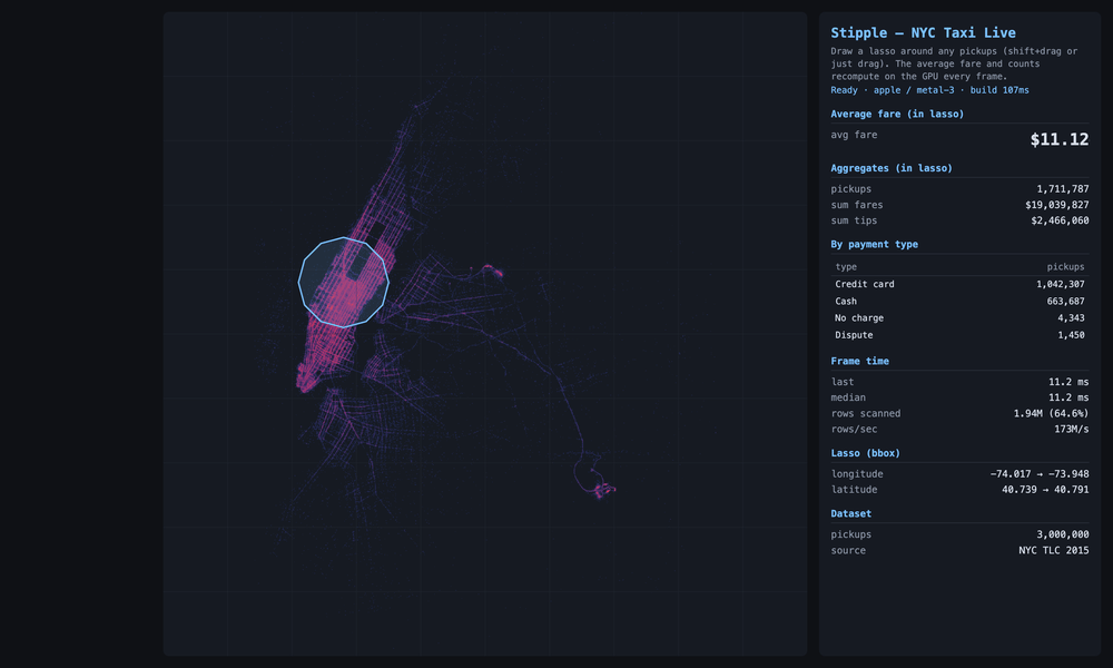
Three million real 2015 NYC taxi pickups, drawn by where they happened. The bright grid is Manhattan; the two clusters out to the right are LaGuardia and JFK. Each lasso I draw is an exact point-in-polygon test on the GPU, and the average fare recomputes every frame: about $11 around Times Square, ~$46 over JFK (the flat airport fare), ~$29 at LaGuardia. The shape I drew is the question; the number is the answer.
Yeah, I know you’re confused
Let’s stick with the taxis. Each ride is a row; its details are the columns: where it started, where it ended, what it cost, what time of day. The usual way to make searching fast is to sort by one column. Sort by time and “every ride that started at 5pm” is instant. But that sorting does nothing for the location columns. Ask for “rides that started near Times Square, ended at the airport, and cost over fifty bucks” and the computer has to check the rows one at a time. When there are billions of rows, that’s very slow.
But GPUs are different. Rasterization doesn’t care how many columns you cross, because the map already IS the data. X-axis on the picture is pickup longitude. Y-axis is pickup latitude. So drawing a circle around Times Square is already a two-column question answered in one stroke. Color the dots by fare, drag a slider to “over fifty bucks,” and the picture filters itself. Circle, slider, time of day. Same single operation every time. And because drawing pictures is the one job a GPU was built for, the hardware this needs has been in every laptop and phone for a decade. No specialty hardware. No specialty drivers. It runs in a browser tab and it’s FAST.
Now, if you know this world, you’re already objecting. People have been pairing GPUs with data for over a decade. OmniSci (now HEAVY.AI) has run databases on them since 2013, and Apple’s Embedding Atlas is a slick recent tool for exploring data visually. But they all share one pattern: finding the answer and drawing it are two separate steps. The machine first works out which dots match (checking them, more or less, one at a time), and then as a second pass, draws the result. Calculate first. Draw second. Two trips. It’s part of why Embedding Atlas starts choking when asked to draw more than four million dots.
Doraiswamy & Haritsa throws out the two-step dance. The taxi dots are already painted on the map, so drawing your circle just lights up the ones underneath it. There’s no separate “go check all the rows” step, because the picture already did the checking when it drew itself. Finding and drawing aren’t two steps anymore. They’re the SAME step. The shape you drew is the question, the chart beside it is the answer. Dragging your mouse IS the search.
So I Built It
I shipped my version a day after reading the paper. It’s called Stipple, and you can install it with pip install stipple (free and open source). It runs inside a Jupyter notebook, which is where most people who work with data spend their day. You can hand it tens of millions of dots, draw a shape around some of them with your mouse, and the count of everything inside that shape updates 60 times a second as you drag it around.
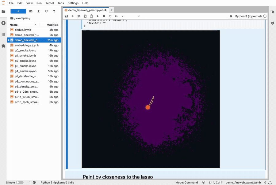
Lassoing a cluster of 10 million FineWeb documents. The colors repaint live as the selection moves.
“60 times a second” is the whole point. You draw your shape, and the dots inside it land back in your notebook in about 80 milliseconds. That’s fast enough that there’s no perceptible lag between letting go of the mouse and seeing the answer in the notebook. Recoloring all ten million dots takes another 30 milliseconds.
The threshold where lag stops being perceptible is about 100ms, so I don’t think it’s possible to interact with data any faster than this.
Different People, Different Uses
As a PM, I tend to focus on making MVPs for very narrow use cases, but this time I went wide. The demo I shipped with the Jupyter widget is pointed at AI researchers. It’s 10 million text documents used to train a language model. You can lasso duplicates or a suspicious-looking clump and read what’s actually inside it. It’s the kind of tool you’d reach for to hunt down test questions that quietly leaked into the training pile (a real and embarrassing problem in AI right now).
And it handles real scale: ten million points live in a single notebook cell, panning and lassoing at 60 frames a second, with a density view that goes well past a hundred million.
Also, the tool doesn’t care what the dots are. Drop in hundreds of millions of credit card charges and you can lasso a fraud ring buying gift cards at 2 a.m. Drop in your company’s cloud bill and you can lasso every job that cost more than ten bucks. Drop in a record of everything your website did last night and you can lasso whatever was slow. Same tool. Wildly different jobs. All of it on your own laptop, no giant server farm required.
How You Can Play
It’s free and open source: pip install stipple, and it runs right inside a Jupyter notebook. Hand it two numeric columns as the axes and one to color by with Stipple(df, x="lon", y="lat", color="fare"), or point it straight at a query: Stipple.from_sql(con, "SELECT ...", x=, y=, color=). Any DuckDB, Postgres, or Snowflake result that returns Arrow drops in by column name.
A few honest things to know first. This is version 0.1, so I’ve shipped just enough to be embarrassed about it. If your data is already two-dimensional (a map, two metrics, anything with natural axes), you’re a one-liner away. If it isn’t (raw embeddings, hundred-column tables), you have to project it down to two coordinates first, and that part is still a script I babysit, not a clean function. The math that decides what’s inside your lasso is exact, but a speed shortcut still has a few edge-case bugs at the very largest sizes. And it reads a snapshot, not a live feed: no tailing a database that’s still being written to. Yet.
This widget is deliberately the small version. The real magic is a standalone tool that does the full GPU-aggregate OLAP thing the appendix gets into, but launching a brand-new standalone app means starting the adoption curve from zero. The one signal I actually want is just if the core idea lands. A widget that lives inside Jupyter costs you nothing to try. Which makes your feedback on this little version the gate on whether I would put work into building a stand-alone app. Open an issue on GitHub and tell me:
- What are you using it for? I built it for one shape of problem, but the underlying tech can do so many cool things.
- What surprised you? Good or bad. The moment it felt fast, or the moment it fell over.
- What’s blocking you from using it in production? The honest gap between “neat demo” and “I’d put this in my real workflow.” That’s the most useful thing you can tell me.
Appendix: For the Database Nerds
Everything above is the version I’d tell someone at a party. If you build databases for a living, here’s the nerdier version.
Why the paper matters. For the last few years, the interesting GPU-indexing work has chased ray tracing. RTIndeX (Henneberg & Schuhknecht, VLDB 2024) and RayDB (PVLDB 2025) both map range and spatial predicates onto RT cores, treating a query as a batch of rays and the data as a BVH to traverse. It works, but it also inherits two problems. RT cores only exist on 2018-and-later NVIDIA-class silicon, and BVH traversal is tuned for sparse ray-scene intersection, not for “test hundreds of millions of points against a region.”
Doraiswamy and Haritsa go backward a hardware generation and use the fixed-function rasterizer instead. You encode rows as primitives, encode the query as a viewport, and let scan conversion do the predicate evaluation as a side effect of drawing. The rasterizer is the oldest, dumbest, highest-throughput block on the die. It’s deterministic, it’s in every GPU shipped since roughly 2010, and its entire job is exactly the operation you want: take geometry, decide which bins it covers, run a fragment program per covered bin. Multi-dimensional indexing falls out for free because every column is just another coordinate, and the output is already a raster, so the index probe and the visualization are the same pass.
Is it an OLAP engine, or just a fast scatter-plot? The widget you install is mostly the second thing: a fast scatter and density renderer with a GPU lasso, a quicker cousin of Embedding Atlas or Nomic (the KDE density tools that downsample past about four million points). It is genuinely fast at that job. I measured a 10-million-point scatter holding a locked 60 fps (16.7 ms per frame, and that figure is vsync-capped, so the GPU has headroom to spare) against matplotlib’s ~1.0 second to rasterize the same frame in the same notebook. That’s roughly 60× per redraw, and since matplotlib re-renders on every pan and zoom, it’s really the difference between a one-frame-per-second slideshow and something you can fling around. The gap only shows up at scale, though; under a few million points matplotlib is fine. So: a good scatter tool that can keep you in flow with 10 million documents, but not a new category (yet).
The demo app I made is the interesting one. It doesn’t just draw the data, it computes over it. Three things it does that a visualization tool doesn’t:
- Exact polygon predicates. The binning index returns a candidate set, then an exact point-in-polygon test runs per candidate in the fragment shader. The polygon is a real WHERE clause, not a viewport crop.
- On-GPU multi-aggregate. count / sum / avg / histogram accumulate via distributed
atomicAddinto a 256-lane partial-sum buffer, then a compute pass reduces the lanes to scalars. (The obvious approach, additive blending into a 1×1 render target, measured 50× slower, because the ROP serializes blends that hit the same pixel; fanning out across 256 cache-line-separated lanes is the fix.) The histogram beside the map is a literal GROUP BY executed in the same frame as the render. Nothing round-trips to the CPU. - WebGPU at interactive latency. The paper reports native batch benchmarks. The app is a faithful WebGPU port: the geometry-shader stages become compute shaders, and fragment-shader storage-buffer atomics replace texture atomics, all running inside a browser tab at sub-frame query latency.
What I measured with it, on my M4 MacBook Air: the indexed path (bbox prune plus fragment-shader PIP) scanned 1.7 to 1.85 billion rows/sec, against roughly 400M rows/sec brute force. A small-rectangle drilldown over 150M rows ran in single-digit milliseconds (3 to 6 ms across runs, well inside the frame budget) against DuckDB-WASM’s several seconds in the same tab. That’s several hundred to over a thousand × on that workload, swinging with machine load; the clip below shows one live run. At SF=100 it built a 7-chunk index of ~86M rows each (~12 GB points buffer, ~12 GB index buffer), and its Q1 came back bit-exact against the DuckDB CLI fixture: counts exact, sums within 0.0012%.
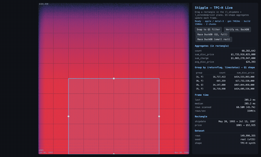
The demo TPC-H app (not the shipped widget), 150 million lineitem rows. I draw a box and the aggregates recompute on the GPU as it moves; then I race the same small drilldown against DuckDB-WASM in the same browser tab and run a bit-exact check. This run: 4.8 ms versus 5.5 s (the panel shows the multiple), and Q1 comes back GREEN, counts identical to the DuckDB CLI. The speedup swings run to run; the bit-exact match doesn’t.
That last detail is the tell. A visualization tool doesn’t verify bit-exact against a SQL engine’s aggregate, because it isn’t trying to be right to the cent. The app was, and that’s the line between drawing data and querying it.
Gotchas, for anyone tempted to build this. WebGPU substrate work fails in ways that don’t throw. No exception. No red text. Just a wrong number that looks fine until you check it against ground truth. Three that cost me hours:
- The 128 MiB binding cap.
maxStorageBufferBindingSizedefaults to 128 MiB. Bind a 200 MB points buffer asstorageand the dispatch still runs, but reads come back undefined and theatomicAdds land in the void.bin_countsstays zero, as if your input were empty. Fix: request the adapter’s advertised max on init, and wrap dispatches inpushErrorScope. - The Metal watchdog. Metal kills a render pass after ~5 seconds, so the “one vertex per row, fragment shader does the work” trick gets silently murdered at 10M+ rows, leaving buffers half-written. Fix: move setup and assignment to compute shaders with a 2D dispatch (which also dodges the 65,535-workgroup-per-dimension cap).
- Silent u32 overflow. WGSL has no f32
atomicAdd, so sums accumulate as fixed-point u32 (fare_cents = u32(fare * 100.0)). Correct per-lane. But the cross-lane reduction overflows u32 around 10^11 and wraps, with no warning. The giveaway is a relative error of almost exactly1 - (true_total mod 2^32) / true_total. See that ratio and stop hunting for a math bug; your accumulator overflowed. Fix: u64 emulation, carrying across two packed u32s by hand.
What it can’t do. It’s a 2D engine. The screen is the index, so any query with more than two continuous dimensions needs the extra columns projected down before the data ever loads, and it has no opinion about how you do that. Sums are fixed-point at a scale you pick up front, not f64, so there’s a precision floor (0.0012 to 0.0016% on the TPC-H runs) and a ceiling on dynamic range.
And it is not a SQL engine. No joins. No subqueries. No arbitrary-cardinality GROUP BY. The “groups” are a small fixed set of accumulators: fine for Q1’s four buckets, useless for GROUP BY user_id. It’s a read-only snapshot, streamed into GPU buffers once, with no inserts, updates, or live tailing. The speedup is selectivity-dependent, too: that headline number is a 0.4%-selectivity drilldown, where the bounding-box prune throws away almost everything before the point-in-polygon test even runs. Run the full ~98%-selectivity Q1 and the prune buys you nothing, so you’re back to a ~32× scan. And it’s memory-bound: 600M rows is ~12 GB of points plus ~12 GB of index, which only fits because the M4’s unified memory is big. A 16 GB discrete card taps out far sooner.
So why ship the scatter widget and not the demo app? It’s way harder to get people to use a standalone app! Sure, if the OLAP engine already verifies bit-exact at a few hundred ×, the obvious move looks like “package that and sell it.” But a standalone OLAP tool means asking people to adopt a brand-new thing from a standing start, and the friction of that adoption curve would drown out the only signal I want right now: does the core interaction (draw, get the answer, stay in flow) actually land for people who work with data all day? A widget that lives inside Jupyter, where they already are, costs nothing to try, so the signal comes back clean. The widget is the wedge. Everything in this appendix is me proving to myself the standalone version is worth building. Whether I build it depends mostly on whether the small version gets used.